As analysts our job is to analyse and compare data. Our visualisations need be aesthetically pleasing, easy to gain insight, and inviting for discovery. ‘Brushing’ is a great technique for comparisons and meets those needs.
Comparison – a consideration or estimate of the similarities or dissimilarities between two things.
To make the most of a comparison in data you want to be able to see the two ‘Things’ together and see the immediate effect when you apply changes.
I’m using the Superstore dataset provided with Tableau to demonstrate the technique of ‘brushing’. I would like to see how each category compares to the overall sales.
Using a Bar chart and filters we can change the data shown.

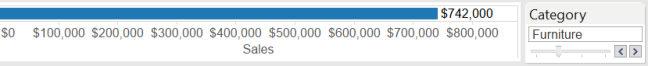
As you can see below, Its hard to see how the sales fit into the total and you find yourself flicking between the categories trying to process the size of the numbers.

The brain must keep a mental image of the previous piece of information and then compare it to the new piece of data shown. Its hard work and adds complexity to finding out the answer to the question.
Brushing acts much in the same way as above using a bar and filter. But the filtered bar sits on top of the total sales bar proportionate to the size of the filtered category. It’s great way to eliminate the thinking process of comparing the information and lets you focus on what you’re actually being shown.
“The furniture category equates to approx 1/3 of the total sales”
It’s such an easy technique, but incredibly powerful, and once you’ve mastered it, you will want to use it in every viz you’ve ever created. I certainly did when I discovered it.
Follow my short step by step guide to achieve a simple brushing example.
To Begin
Open Tableau and connect to the Superstore Dataset and set up a table like the one shown below. Sales by Category:

Step 1
Create a FIXED LoD calculation to fix the Level of Detail your total will be shown at. Ours will be at overall total level. { FIXED : SUM([Sales]) }
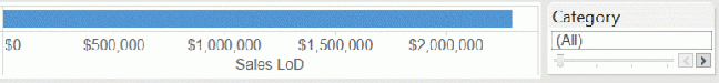
See that the [Sales LoD] is showing the Overall Total. Now anything you use in your viz will only impact the Sum([Sales]).The [Sales LoD] will ignore any filters applied and always show your total (to the level you have set your LoD calculation)


For more information on LoDs checkout the below video, Intro for LOD expressions by Craig Bloodworth @ the Information Lab:
Step 2
Drag your measures ([Sales] and [Sales LoD]) onto the columns part of the Viz to create a bar chart.
You can still see that the [Sales LoD] is showing the overall total.

Step 3
Now drag Category into the filter and ‘Show Quick Filter’
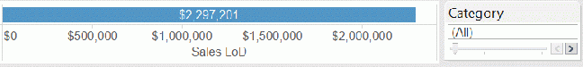
Check the Filtering and see how the [Sales LoD] is effected.


Step 4
Right click on SUM(Sales) and ‘Dual Axis’, Then right click on the Sales Axis and ‘Synchronise Axis’
This will now put the two bars on one axis and synchronise them so that the bars behave proportionately to each other. Then you can hide one axis.

Step 5
Change the colours to the same and then reduce the transparency to give the impression of a shadow over the total. (I’ve used blue and a transparency of 50%)

Now when you use the quick filter you will see the filtered bar ‘Brushing’ over the total bar showing you where the category lies within the total.
And that’s it. It really is as simple as that.
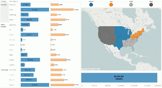
As you can see ‘Brushing‘ is an easy technique that makes a comparison really easy to show. With ease you can see how the selected category compares with the overall sales answering our original question.
“All three categories make up approx 1/3 of the sales, Technology slightly more than the others. “
Now you have the basics you can produce something like below which is really easy to interact with and explore. You always have the totals for comparison giving you more opportunity to discover something new about your data.
Thanks for taking the time to read my first blog post. I hope you’ve learnt how to ‘brush‘ and how it can be used. Any feedback would be appreciated and feel free to share!
https://public.tableau.com/profile/joanna.pakes#!/vizhome/Brushing/Brushing
